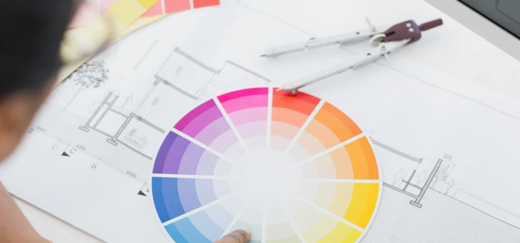
Understanding the Colour Wheel
Let’s dive into the vibrant world of colour wheels and unleash the comedic mishaps of hues and tones! Join us as we demystify the basics of colour theory and the significance of colour relationships for artists who want to ensure their palettes don’t end up in a hilarious tangle.
Basics of Colour Theory
Colour theory is the colourful basis for creating visually appealing art. Born from the brilliant minds of philosophers, artists, and scientists, it dates back to Aristotle and the Arab scientist Ibn al-Haytham during the Islamic Golden Age (HubSpot). Sir Isaac Newton, a sassy scientist, gave us the first colour wheel in 1666, and it has since evolved into a trusty guide for artists (DecoArt).
The colour wheel typically showcases three primary colours, three secondary colours, and six intermediate (tertiary) colours, for a total of 12 main divisions (Wikipedia). Imagine them as the guest list at a vibrant party—primaries being the hosts, secondaries as elite guests, and intermediates crashing in for extra fun.
| Colour Type | Colours |
|---|---|
| Primary | Red, Blue, Yellow |
| Secondary | Green, Orange, Purple |
| Tertiary | Red-Orange, Yellow-Orange, Yellow-Green, Blue-Green, Blue-Purple, Red-Purple |
Colour theory helps artists avoid “awkward hue moments” by guiding them on how to mix and match colours harmoniously, creating stunning, heartwarming, or simply stupendous pieces of art without any unintentional clashes (David M. Kessler Fine Art).
Significance of Colour Relationships
Colour relationships are the elegant dance moves performed by colours on the wheel. Understanding these relationships helps artists nail those palettes and avoid causing a “colour catastrophe.” Here’s the comical rundown of the major relationships:
- Complementary Colours: These wacky pairs sit opposite each other on the wheel. Think of them as frenemies—they contrast each other in the funniest, boldest way possible. Examples: Red and Green, Blue and Orange.
- Analogous Colours: These are the best buddies of the colour world, sticking together side-by-side and partying in harmonious hues. Examples: Blue, Blue-Green, Green.
- Triadic Colours: These energetic trios are evenly spaced on the wheel, bringing balance and excitement to any work of art. Examples: Red, Blue, Yellow.
Artists benefit greatly from understanding these relationships, as they allow for the creation of visually satisfying harmonies and captivating contrasts. For more on achieving artistic zen with colours, check out our guide on creating colour harmonies.
Ready to embark on this colour adventure? Just remember, when in doubt, consult the wheel—your masterpiece awaits, minus the hue hiccups!
Types of Colour Wheels
Colour wheels may seem like simple circles with pretty colours, but they wield immense power in the hands of an artist! There are different types of colour wheels that cater to the unique needs of various art forms. Let’s delve into the world of colour wheels and uncover their colourful secrets.
Traditional Artists’ Colour Wheel
The traditional artists’ colour wheel, also known as the RYB (Red, Yellow, Blue) colour wheel, is a staple in the art world. This wheel is the go-to for painters and non-digital visual artists. It’s based on the primary colours: red, yellow, and blue. Combining these primaries yields the secondary colours: green, orange, and purple. Mix a primary with a secondary, and you’ve got yourself tertiary colours like yellow-green, red-violet, and blue-green (Wikipedia).
| Primary Colours | Secondary Colours | Tertiary Colours |
|---|---|---|
| Red | Green (yellow + blue) | Yellow-Green (yellow + green) |
| Yellow | Orange (red + yellow) | Yellow-Orange (yellow + orange) |
| Blue | Purple (blue + red) | Blue-Green (blue + green) |
| Red-Violet (red + purple) |
Sir Isaac Newton might have invented the colour wheel in 1666, but we’re still using it today with all its scientific glory (House Beautiful).
Additive Colour Wheel
Now, let’s go high-tech with the additive colour wheel, which is mainly used in digital art and displays. Imagine working as a digital artist; your primaries are red, green, and blue (RGB). When you mix these primaries, you obtain white light. It’s the magic behind your screen! The secondary colours in this wheel are cyan, magenta, and yellow. The more you mix, the lighter the colour becomes.
| Primary Colours (RGB) | Secondary Colours | Resultant Colours |
|---|---|---|
| Red | Cyan (green + blue) | Magenta (red + blue) |
| Green | Magenta (red + blue) | Yellow (red + green) |
| Blue | Yellow (red + green) | Cyan (green + blue) |
| (Mix All) | White Light |
The additive colour wheel has transformed the way light and colour are perceived in digital media, making it a vital tool for graphic designers and digital artists.
Subtractive Colour Wheel
Enter the subtractive colour wheel, crucial for anyone dabbling in the world of printing or painting with modern pigments. This wheel is based on the CMY (Cyan, Magenta, Yellow) model. By mixing these subtractive primary colours, you get black. However, in the traditional subtractive wheel used by painters, you would use red, yellow, and blue primaries (RYB). People who use digital printers and modern subtractive methods prefer magenta, yellow, and cyan (Wikipedia).
| Primary Colours (CMY) | Secondary Colours | Resultant Colours |
|---|---|---|
| Cyan | Red (magenta + yellow) | Magenta (red + blue) |
| Magenta | Green (cyan + yellow) | Cyan (green + blue) |
| Yellow | Blue (cyan + magenta) | Yellow (red + green) |
| (Mix All) | Black (CMY) |
Whether you’re painting a masterpiece or printing a perfect photograph, the subtractive colour wheel is your best friend for achieving accurate hues and tones.
Embrace the hues, tints, and shades with each turn of the wheel, and watch your art come to life with a riot of colour!
Primary, Secondary, and Tertiary Colours
Role of Primary Colours
In the grand theatre of the colour wheel chart, the primary colours are the headliners. Red, blue, and yellow take centre stage, each refusing to be upstaged by any mix of colours. These hues are the divas of the art world; they cannot be formed by any combination of other colours (Jenna Rainey). Their role? Simply to exist and be fabulous. Every great piece of art starts with these three prima donnas.
Formation of Secondary Colours
Enter stage left: the secondary colours. These are created by mixing two primary colours, forming a harmonious trio in their own right. Let’s break down this colourful chemistry set:
- Blue + Yellow = Green
- Red + Yellow = Orange
- Blue + Red = Violet
In this dazzling display, green, orange, and violet are formed (DecoArt). They may live in the shadow of their primary counterparts, but don’t underestimate their punch. These hues play a pivotal role in creating a well-balanced and vibrant palette.
Understanding Tertiary Colours
Tertiary colours are the backstage crew making the show seamless. Formed by mixing a primary colour with a secondary colour, they bring nuance and depth to any artistic endeavour. The tertiary team consists of:
- Yellow + Green = Yellow-Green
- Yellow + Orange = Yellow-Orange
- Red + Orange = Red-Orange
- Red + Violet = Red-Violet
- Blue + Violet = Blue-Violet
- Blue + Green = Blue-Green
These hybrids ensure the transition between primary and secondary colours is smooth and harmonious (DecoArt).
Here’s a handy table to keep everyone in check:
| Colour Type | Example | Components |
|---|---|---|
| Primary | Red | N/A |
| Primary | Blue | N/A |
| Primary | Yellow | N/A |
| Secondary | Green | Blue + Yellow |
| Secondary | Orange | Red + Yellow |
| Secondary | Violet | Blue + Red |
| Tertiary | Yellow-Green | Yellow + Green |
| Tertiary | Yellow-Orange | Yellow + Orange |
| Tertiary | Red-Orange | Red + Orange |
| Tertiary | Red-Violet | Red + Violet |
| Tertiary | Blue-Violet | Blue + Violet |
| Tertiary | Blue-Green | Blue + Green |
Understanding and playing with these colours can turn any artist into a colour wheel maestro. Next time you grab your brushes and begin, remember the primary, secondary, and tertiary players waiting in the wings, ready to illuminate your canvas with their symphony of hues. For more on the practical applications and emotional impacts of colour, see our sections on using the colour wheel for custom palettes and embracing colour emotions.
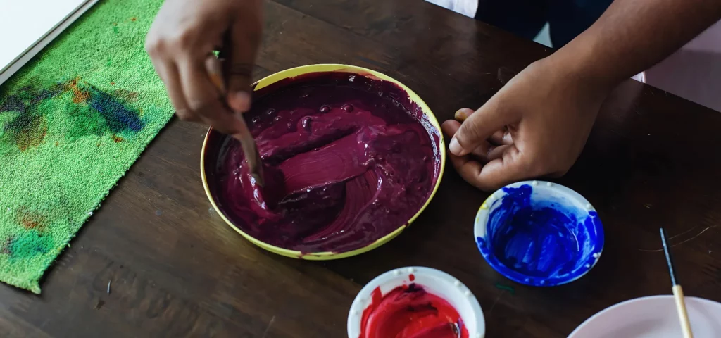
Creating Colour Harmonies
Who said the colour wheel was just for classroom doodles and kitschy art projects? It’s time to get serious—well, maybe not too serious—about creating stunning colour harmonies that will make your palette sing. The colour wheel chart isn’t just a circle with pretty hues; it’s a treasure map leading you to gradients of artistic gold.
Complementary Colour Scheme
Imagine pairing crimson with emerald or indigo with a splash of sunflower yellow. Complementary colours are opposite each other on the colour wheel chart, creating a vibrant contrast without clashing (House Beautiful). This means your artwork will have pop and pizzazz, making it unforgettable.
| Colour | Complementary Colour |
|---|---|
| Red | Green |
| Blue | Orange |
| Yellow | Purple |
Using complementary colours, especially in lively interiors or bold artwork, can create a dynamic balance that zestfully engages the viewer. Imagine an orange area rug paired with a turquoise ceiling—pure design magic!
Triadic Colour Scheme
Enter the carnival of the colour wheel: the triadic scheme! With colours evenly spaced around the wheel, triadic palettes consist of hues like blue-green, red-violet, and yellow-orange. Talk about a party! These combinations offer vibrancy while maintaining a balanced harmony (David M. Kessler Fine Art).
For instance:
| Colour | Triadic Pairings |
|---|---|
| Blue-Green | Red-Violet, Yellow-Orange |
| Red | Yellow, Blue |
| Purple | Green, Orange |
A cool-toned triadic palette offers a playful yet sophisticated effect, perfect for settings that need a splash of spunky energy without looking like a Pokémon exploded in your room (House Beautiful).
Analogous Colour Scheme
Analogous palettes are the coziest of colour schemes. Imagine colours that cuddle up right next to each other on the colour wheel chart. These kindred spirits create a serene and cohesive look, ideal for those tranquil, harmonious vibes (David M. Kessler Fine Art).
| Colour | Analogous Tones |
|---|---|
| Red | Red-Orange, Red-Violet |
| Blue | Blue-Green, Blue-Violet |
| Yellow | Yellow-Green, Yellow-Orange |
Designer Garrow Kedigian used an analogous palette in his living room to create a bold yet harmonious space. Think of analogous colours as the squad goals of the colour world—each shade supports and enhances the others (House Beautiful).
With these cheeky yet effective colour schemes, your colour mixing adventures will always have the right blend of harmony and excitement. So grab your colour wheel, and let the artistic antics begin!
Practical Application of Colour Theory
Importance in Art Creation
Understanding colour theory is akin to wielding a magical wand in the realm of art. Colour theory is crucial for artists to mix custom palettes, match colours, and grasp the effects of warm and cool shades (Jenna Rainey). It helps artists replicate real-life colours on canvas, bringing their creations to life. The colour wheel serves as a handy reference for these tasks, particularly in mediums like oils, acrylics, and watercolours (My Art Shop).
Using Colour Wheel for Custom Palettes
Creating custom palettes can be an adventure, and the colour wheel is the artist’s trusted guide. By selecting hues adjacent to each other on the wheel, artists can harmonize colours for a cohesive look. For contrast and depth, they opt for opposing colours, adding a dramatic flair to the artwork (Chuck Black Art).
| Colour Scheme | Description |
|---|---|
| Complementary | Colours opposite each other on the wheel |
| Analogous | Colours next to each other on the wheel |
| Triadic | Colours evenly spaced on the wheel |
For artists keen on precision, tools like the Colour Wheel and the Potentate Artist’s Colour Diary can be invaluable. These tools enable them to experiment and document their colour mixing techniques, ensuring consistent results in future projects.
Embracing Colour Emotions
Colours are powerful beings. They can influence emotions, evoke moods, and even guide user navigation in a layout (HubSpot). Artists utilize colour to convey specific feelings in their work. For example:
- Red can symbolize passion or danger.
- Blue often represents tranquility or sadness.
- Yellow brings forth cheerfulness and energy.
By understanding the emotional impact of colours, artists can create more impactful and emotionally resonant art pieces. For those seeking to explore and harness the full spectrum of colour emotions, keeping a Colour Diary can be a playful yet practical step.
Colour Wheels in Artistic Tools
For the creative artist, the colour wheel chart is a trusty sidekick. Whether they’re mixing hues or planning palettes, these wheels help artists get their colours in a row. Here’s a closer look at the vivid world of colour wheel products and how they can enhance artistic endeavours.
Range of Colour Wheel Products
Colour wheels come in all shapes and sizes, each boasting unique features to assist with colour mixing. A popular pick among artists is the “Colour Wheel 9.25” Diameter,” ideal for visualising the relationships between primary, secondary, and tertiary colours. Another handy tool is the “Colour Wheel Gray Scale and Value Finder,” which helps determine colour value across different media (My Art Shop).
Here’s a quick comparison of some popular colour wheel products:
| Colour Wheel Product | Key Feature |
|---|---|
| Colour Wheel 9.25″ Diameter | Organises colours in a circle |
| Watercolour Colour Wheel | Designed specifically for watercolour art |
| Colour Wheel Gray Scale and Value Finder | Determines colour value in all media |
| Mont Marte Mini Colour Dial | Compact for easy portability |
| Potentate Artists’ Colour Diary | High-quality watercolor paper |
Potentate Artists’ Colour Diary
The Potentate Artists’ Colour Diary is not just another sketchbook. It’s a diary for your colourful imagination. Equipped with cold-pressed, acid-free, 300gsm watercolour paper, this diary is perfect for watercolour techniques and other media (My Art Shop). The high-quality paper ensures that whatever you create stands the test of time.
The diary provides a platform for artistic exploration, allowing artists to experiment, create, and express themselves. It’s also quite durable, holding up well to various artistic techniques. You can splash away with watercolours or delve into mixed media—this diary welcomes all artistic adventures.
Check out Potentate Artists’ Colour Diary for more details on this colourful marvel.
Versatile Applications in Art Media
Colour wheels and diaries are practical for a range of artistic media:
- Oils: Mixing the perfect shades and tints.
- Acrylics: Creating both opaque and transparent effects.
- Watercolours: Ensuring the right balance of hues for washes and gradients.
- Mixed Media: Combining various materials while maintaining visual harmony.
Artists can gain a deeper understanding of colour mixing techniques by frequently consulting their colour wheels. From achieving vibrant contrasts to subtle gradients, these tools are indispensable for creating stunning artwork.
In conclusion, whether you’re a seasoned artist or just starting your creative journey, having the right set of colour wheels is a game-changer. Dive into the spectrum and let your creativity flourish. For further information on colour mixing guides, check out the full range of products and resources available.
Advancing Colour Knowledge
Colour Mixing Techniques
Unlocking the magic of colour mixing may seem like an endeavour reserved for wizards and alchemists, but fear not! With the colour wheel chart as your trusty sidekick, you’ll be mixing hues with the precision of a master painter in no time.
Basic colour mixing starts with primary colours (red, blue, yellow). These are the unmixables, standing proud in their fundamental hues. From these illustrious beginnings, secondary colours (orange, green, violet) are born by pairing up primary colours. Tertiary colours add even more pizzazz, being concocted from a primary and a secondary colour (Jenna Rainey).
| Base Colours | Resulting Colour |
|---|---|
| Red + Yellow | Orange |
| Blue + Yellow | Green |
| Red + Blue | Violet |
| Yellow + Orange | Yellow-Orange (Tertiary) |
| Blue + Green | Blue-Green (Tertiary) |
For high-quality colour wheels and matching wizardry tools, refer to our range of colour wheel products.
Achieving Colour Harmony
Achieving colour harmony is like conducting a symphony where every note must contribute to a flawless, harmonious song. Each colour relationship on the wheel has a role, from the diva-like complementary colours to the harmonious triadic ensembles. The trick lies in knowing which to pick for the visual melody you wish to create.
Complementary Colours: These are diametrically opposite on the colour wheel and bring drama and vibrancy to your masterpiece. Think red and green, blue and orange, or yellow and violet.
Triadic Colour Scheme: Picture an equilateral triangle on your colour wheel. The tips of this triangle select three colours that strike a perfect balance. For instance, red, blue, and yellow form a classic triadic combo.
Analogous Colours: These cosy up side-by-side on the wheel, creating serene and cohesive designs. Imagine the soothing flow from blue to blue-green to green.
Exploring Colour Schemes
Diving deeper into the colour wheel chart, various schemes can be explored to enhance your artistic prowess. The wheel prominently displays visual relationships, aiding in creating various schemes such as complementary, analogous, and triadic, along with the more complex split-complementary, tetradic, and square colours. Each scheme presents a unique visual impact, offering distinct levels of contrast and harmony.
For example:
- Split-Complementary Colours: Choose a base hue and pair it with two colours adjacent to its complement. This provides pops of contrast without intense drama.
- Tetradic Colours: Four hues form two pairs of complementary colours. This strategy allows for a dynamic and intricate colour palette.
- Square Colours: Equally spaced on the wheel, these form a square and provide a balanced yet compelling mixture.
By exploring these schemes, artists can use custom palettes effectively, complementing work and creating mood and depth (Jenna Rainey).
To harness these insights practically, an artist might record colour experiments in a vibrant colour diary. For more sophisticated artistic tools, head over to Potentate Artists’ Colour Diary.
Embark on your colourful escapades with newfound confidence, knowing you now possess the knowledge to navigate the intricate landscape of colour theory and mix vibrant hues like a seasoned artist.